Fluid Framework
A modern, semantic CSS design system. Like water: adaptable, natural, powerful yet gentle.
Make an Impact
Fullscreen heroes command attention. Use them sparingly for maximum effect.
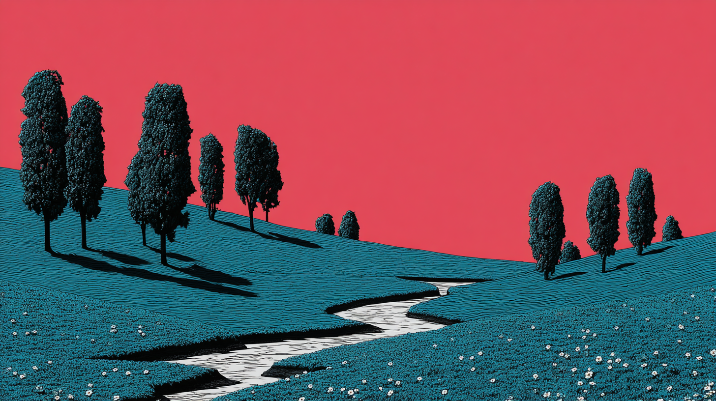
Serene Gradients
Subtle color transitions create depth without distraction. A calm brook, not a crashing wave.
Content & Media
Split layouts pair text with visuals. Perfect for product showcases and feature sections.
Media First
Reverse the split for visual variety. HTML stays logical, CSS handles the visual order.
Background Images
Use overlays to ensure text readability over images. Light, medium, heavy, or gradient options.
Gradient Overlay
Content positioned at the bottom with a gradient fade. Great for cinematic presentations.
Compact Heroes
Perfect for interior page headers. Less vertical space, same impact.
Left-Aligned Content
Not everything needs to be centered. Left alignment feels natural for content-heavy heroes.
Focused Message
Narrow content width creates focus. Every word counts.